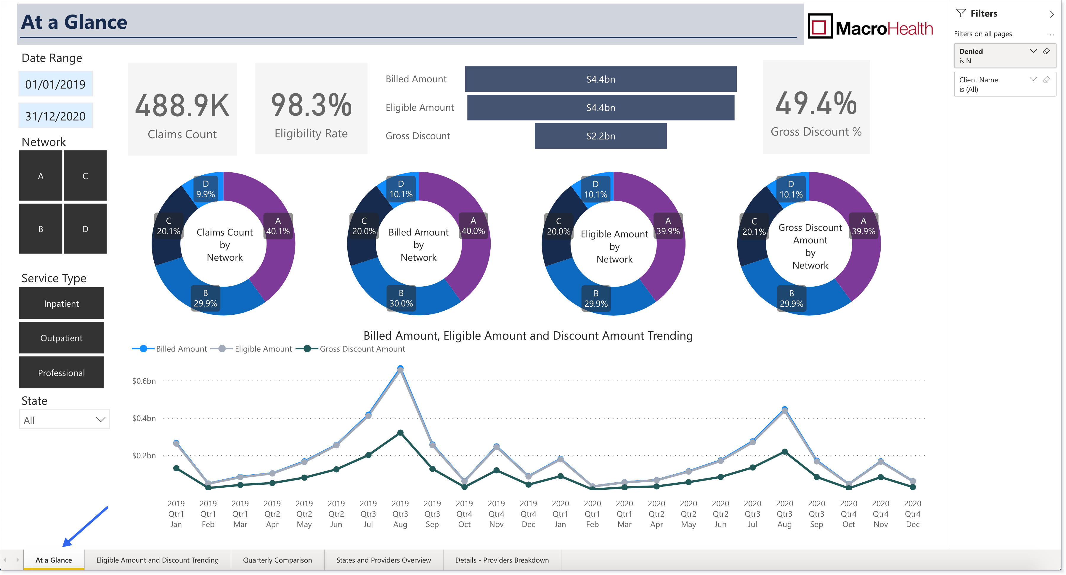
At a Glance
The At a Glance report is a one-pager that provides information on how the MacroHealth Solution is performing on key metrics across the board.

Generating the Report
Note
Once selected, the report will update automatically with the metrics specified.
In the Report Navigation Menu, click At a Glance.
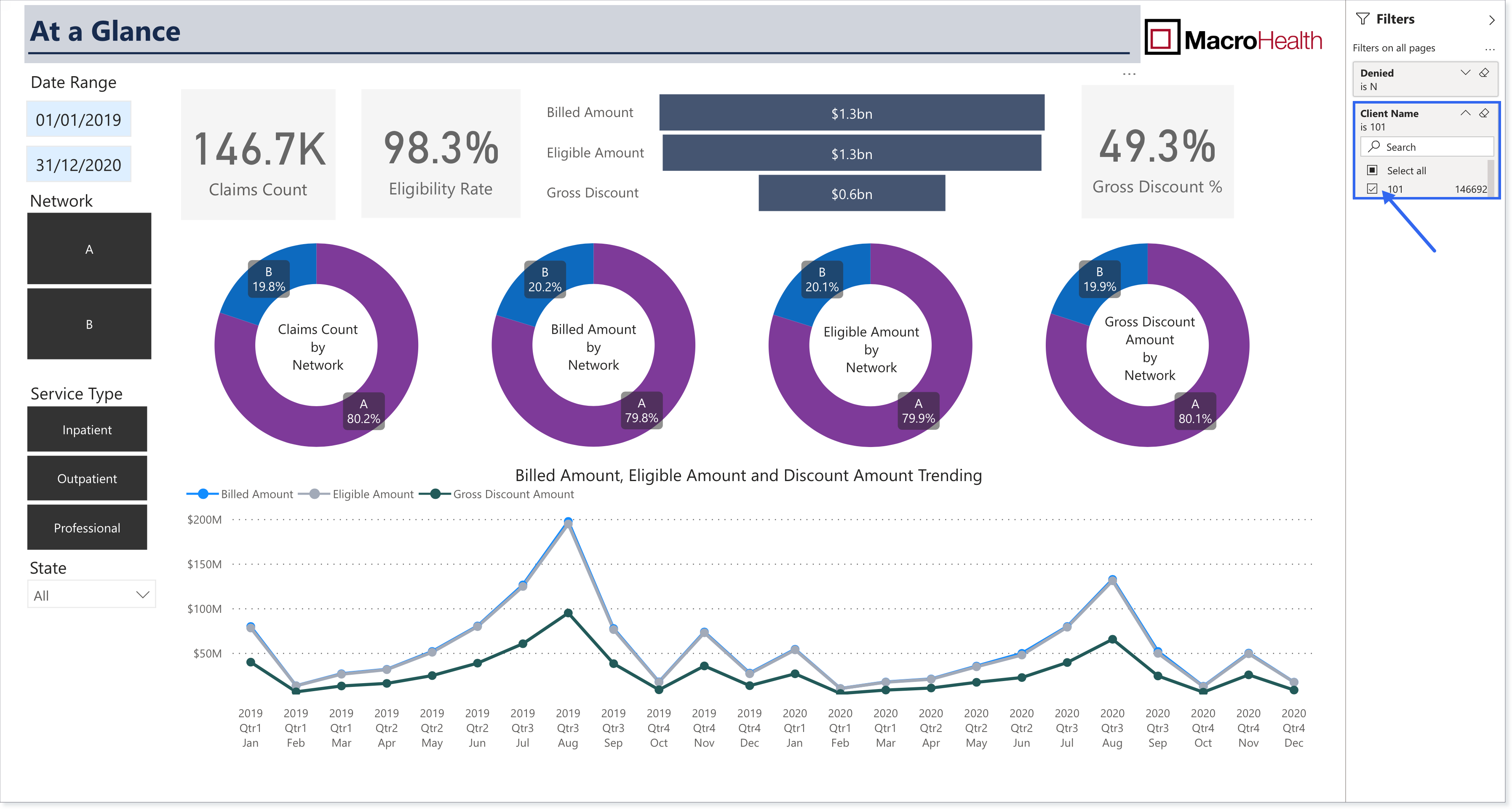
In the Right Side Filters panel, select if you want to include claims that have been Denied.
N: Do not include denied claims.
Y: Include denied claims.

Verify that your company name is selected in the Client Name filter. It will be checked by default.
Using the Left Side Filters, select a Date Range. In the first field choose a start date and in the second field, an end date.


If applicable, refine the data results by Network. Data will appear for rectangles that are black. Clicking a rectangle deselects it.

Choose for which Service Type you want the data to be displayed:
Inpatient: medical claims from institutions that require overnight hospitalization (e.g., hospitals)
Outpatient: medical claims from institutions that do not require overnight hospitalization (e.g., ambulatory care)
Professional: medical claims from professionals (e.g., individual doctor's office)

Using the State dropdown menu, choose which State(s) you want the report displayed for. Data will appear for States that have a black square. Click to deselect. It is possible to select more than one State.

At a Glance Report Explained
The At a Glance report features Percentages, a Bar graph, Donut charts, and a Line chart. The following section provides details for each of these elements.

Note
Billed Amount, Eligible Amount, Discount Amount, and Claim Count are visualized based on a claim's last processed date. (For a more detailed explanation see Section : “The Reports” page)
Claims Count: Total number of claims that have been processed
Eligibility Rate: Percentage of eligible amount among billed amount (Eligible amount / Billed amount)
Bar graph:
Billed Amount: Total dollar amount of processed claims
Eligible Amount: Total eligible portion of processed claims.
Gross Amount: Total dollar amount of Network provided discounts
Gross Discount %: Percentage of gross discount among eligible amount (Gross Discount / Eligible Amount)
Donut charts:
Claims Count by Network: Percentage breakdown of claims by Network
Billed Amount by Network: Percentage breakdown of billed amount by Network
Eligible Amount by Network: Percentage breakdown of eligible amount by Network
Gross Discount Amount by Network: Percentage breakdown of gross discount by Network
Billed Amount, Eligible Amount and Discount Amount Trending: A view of the above metrics over time to identify peaks and valleys, as well as, differences between these metrics.